
FINN SISU SOCIAL MEDIA
FINN SISU SOCIAL MEDIA was a branding and social media project completed at >Greater Thought Design + Marketing. This project entailed creating a brand look with brand elements and applying it to social media. My role in this project included developing the color palette, a set of iconography, and two sets of patterns and creating the first drafts of around 15 social media posts. Pictured below are a few of the final posts after the collaboration of the design team.

The Brand Elements
Finn Sisu is a local retailer specializing in canoeing, cross country skiing, and Finnish sauna supplies. The design challenge was creating a cohesive brand look that also distinctly represented each of these retail lines. The brand look also pays homage vintage minimalist Nordic design–putting a modern twist on a classic design.
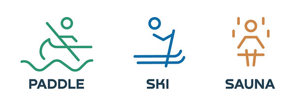
A ski and sauna icon was created to match the style of an existing paddle icon.
This set of patterns was developed from the existing triangular shape present in the logo. This pattern varies in shape and opacity, and often used to frame photo elements in the social media.


This set of patterns is inspired by each of the different lines created by or in water in each of the 3 activities. The green pattern represents waves being created by a canoe at a bird-eye view. The blue pattern shows the tracks left by skis in the snow at a bird-eye view. The brown pattern symbolizes steam rising through the sauna.